
What does it mean to say that a house is “set well into the landcape?” On the West Coast of Canada, where I used to live, it usually meant that a house was invisible, often made of wood and blending into the trees. But here in rural West Cork, buildings are more assertive – we ARE the landscape, they seem to say, or at least an important part of it. Therefore we should stand out and be seen. Part of being seen, for many houses in the countryside, is choosing a bright colour. Ah sure, they say, all it needs is a lick of paint.
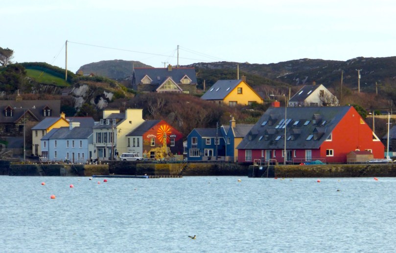
Crookhaven
I’ve written before about the colourful towns and villages dotted all over Ireland. Coming around a bend in the road and catching sight of a village is a cheering experience: flashes of colour spread in a line across a backdrop of green fields or rugged mountains. But colour isn’t confined to towns – farmhouses in the deep countryside can suddenly demand attention – pops of colour in a predominantly green terrain.


Blue seems to be a favourite – and we are not talking here about a pale blue or grey blue. No – duck egg or cobalt blues predominate. The blue is weathering and fading a bit in the house below but it still packs a punch in its isolated setting.


Sometimes blue is used on one side of the house only, or on selective aspects – a gate post or a shutter.


One of my favourites is this house, the colour of a ripe apricot. It is visible from a long way off and always seems to be incandescent on its hillside, as if permanently lit by a setting sun. Close up, I found it has jade green trim, making it even more handsome than it appears from a distance.
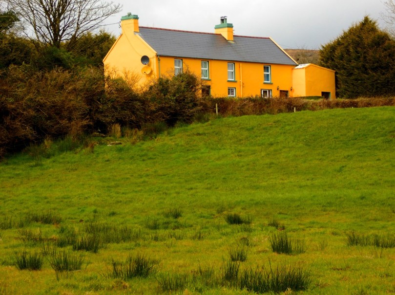
That colour is also one of the most recognisable in West Cork because it’s the colour of Jeremy Irons’ Kilcoe Castle. When the castle was being rendered, Irons used a lime mortar in order to waterproof the masonry: the mortar has a distinctive peach tone. Although controversial at the time, it is fair to say that West Cork folk have come to enjoy the sight of this wonderful restored 13th Century castle permanently glowing on its tiny island.
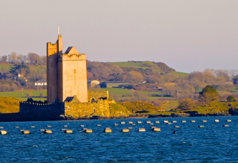
Kilcoe Castle
Pinks range from soft and pastel to the colour of fuchsia.


I particularly like the pink-on-pink trim of the farmhouse below left, and the candy-coloured house with its blue trim.


Yellow shows up well against a green hill. The first house below belongs to our friends the Camiers, who run the marvellous Gortnagrough Folk Museum. The second one is on the Sheep’s Head (photo by Amanda Clarke).


There are shades of salmon and coral that seem to suit old houses very well. Left, below, is the old school house in Rossbrin, now a private residence, and right is the Ballydehob Rectory, particularly attractive with its green trim.


I’ve found red to be reserved mostly for doors, trim and spot colour, but my friend Amanda Clarke found this old farmhouse on the Sheep’s Head. Take a look at her site, Sheep’s Head Places for examples of vernacular farm buildings.
Old farmhouse, Sheep’s Head*
Renovations never stop – I did wonder what colour this one would end up. Now I know!
Going through the spectrum
But this one, unless miracles happen, will see no more paint. Then again, it’s right beside a holy well, so maybe…
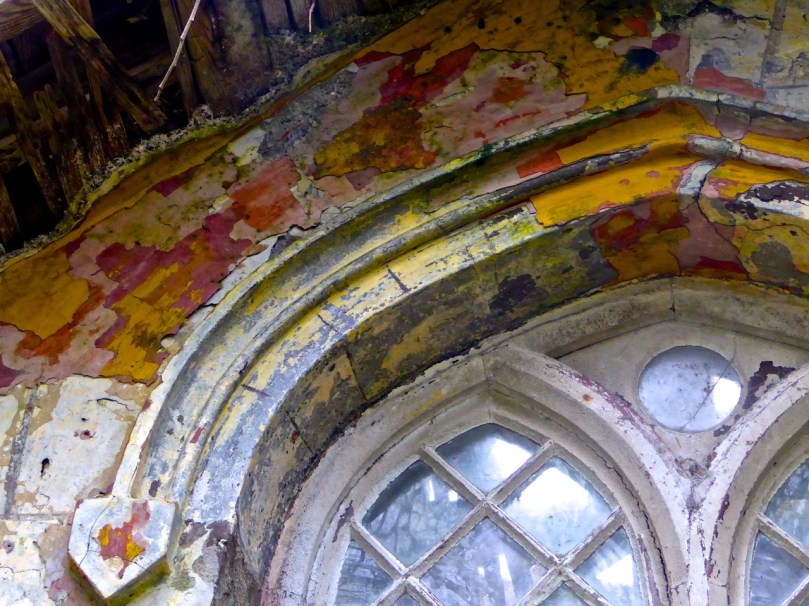
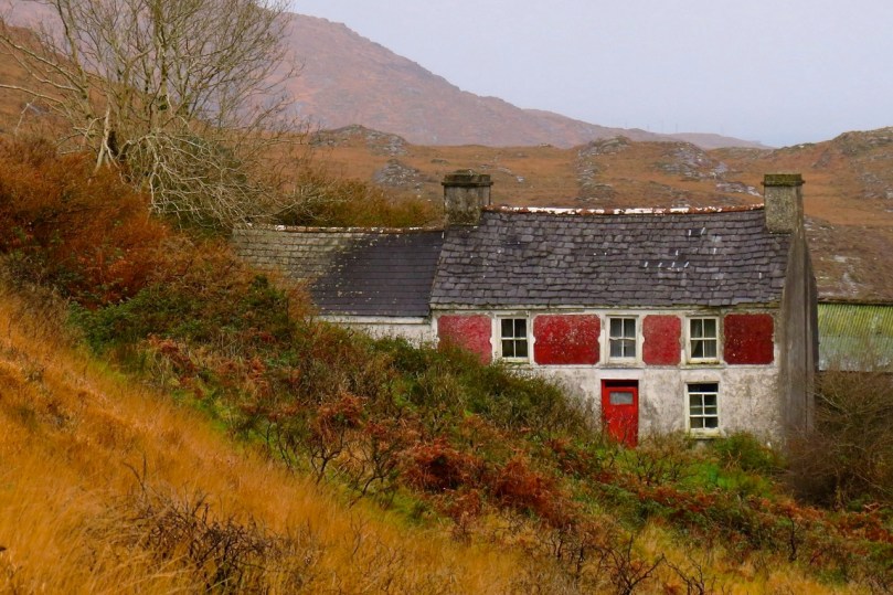
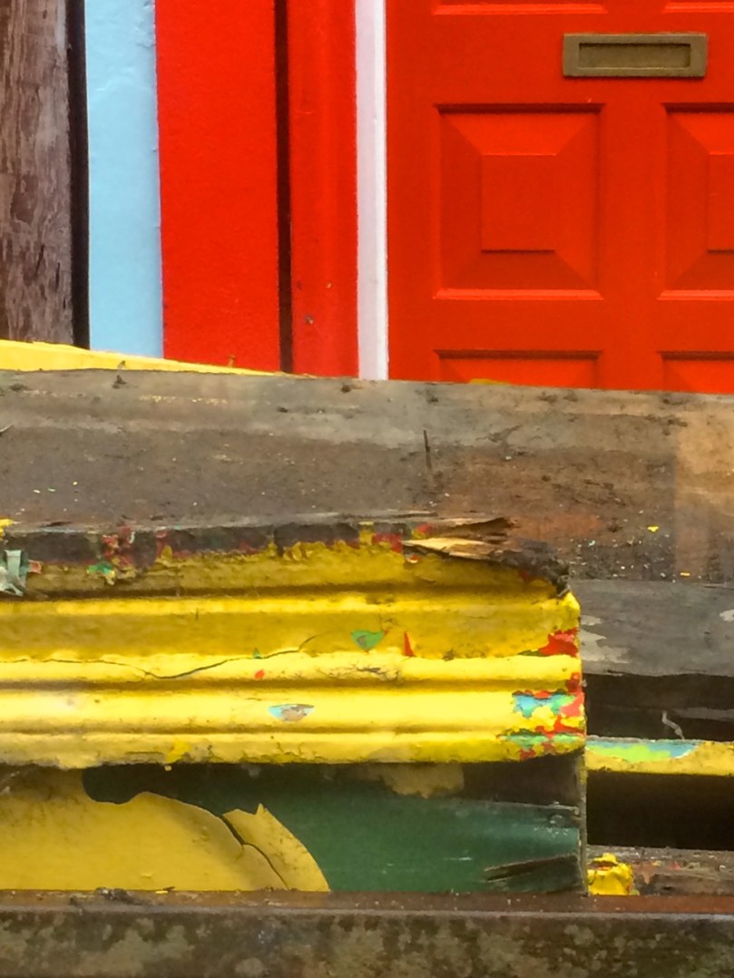
Generations of colour
*Many thanks to Amanda Clarke for the use of the asterisked photographs

Brilliant photos and text! Finola I recall a bright green house on the Kealkil Cork road a long 5 bay farm… An aquaintance (family from Portlaoise told me only Protestants paint their houses pink!
LikeLiked by 1 person
Hmmm…first time I’ve heard of Protestant Pink. Wonder what the corollary is…Catholic Copper? Prebyterian Peuce? Pagan Purple?
LikeLike
Colorful. Cheerful. Thought provoking. They were all so lovely. Great post!
LikeLiked by 1 person
Thanks so much and glad to see a fellow enthusiast!
LikeLike
Finola- you are one very special woman! You’re creative eye and gift of writing is magnificent! Thank you for taking the time to share your world with us. I am especially enjoying it on a snowy Philadelphian day! I love, love the color against the landscape. Next thing we’ll see is you sitting out there with an easel and painting! xoxo
LikeLike
Ah, go on…you’re too kind. Alas, I have no artistic ability. Still at the stick man stage.
LikeLike
I can never decide about attention seeking property colours ….. are they courageous on the landscape or outrageous blots on the landscape. I constantly swing, nevertheless, courageous of you to deal with the topic Finola.
LikeLike
No courage needed, Brendan. For me, these colourful houses are a unique part of the Irish countryside and I think they add a particular charm.
LikeLike
You should spend some time in the Canadian Maritimes. You’ll find every colour under the sun.
LikeLike
I know – I loved Nova Scotia. The West Coast is a different story, though, isn’t it?
LikeLike
Yes, it’s Much more weather beaten than pretty in the remote areas that I used to work in.
LikeLike
I loved this post with all those colourful homes. Thanks
LikeLike
Glad you liked it, Lydia!
LikeLike
Hello Finola! You have included our home place at Fahane on this along with Tobins which was previously Attridges, ours was the blue with a red square on the front door. While Tobins has the red panels & red front door.
LikeLike
How fantastic! I love them both.
LikeLike
Oh my word … do I have a purple house for you and an orange one, if I can find them in my archives … and plenty more where they came from. How I love this post, one of my favorite things about the Southwest!
LikeLike
Aha! A fellow collector, I see.
LikeLike
Very cheery!
LikeLike
Reblogged this on West Cork History.
LikeLike
Thanks for the share, Pat and glad you liked all this colour!
LikeLike
A wonderfully colourful journal today! My fave is that glimpse of blue and white shutter! The pink on pink is also very striking. And the Generations of Colour is just amazing, I would love ot have seen that house in its heyday.
LikeLike
Thanks for your photographs! Now we must hunt for purple and green houses. I know they are out there.
LikeLike