
What does it mean to say that a house is “set well into the landcape?” On the West Coast of Canada, where I used to live, it usually meant that a house was invisible, often made of wood and blending into the trees. But here in rural West Cork, buildings are more assertive – we ARE the landscape, they seem to say, or at least an important part of it. Therefore we should stand out and be seen. Part of being seen, for many houses in the countryside, is choosing a bright colour. Ah sure, they say, all it needs is a lick of paint.
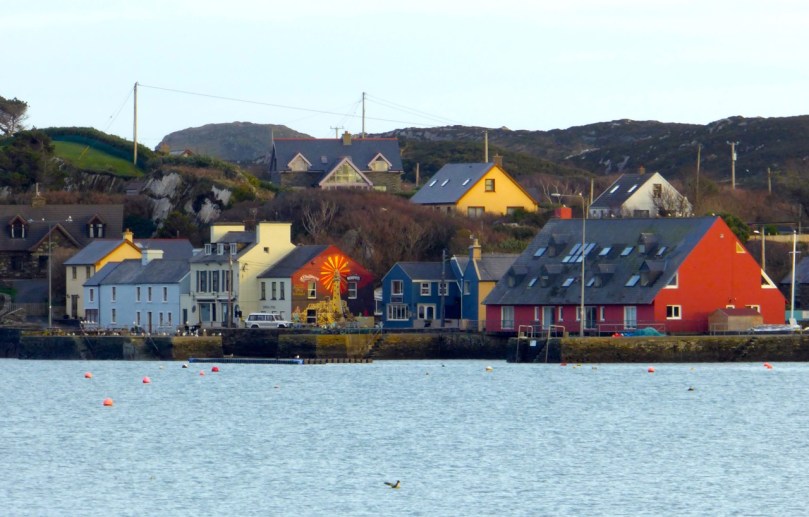
Crookhaven
I’ve written before about the colourful towns and villages dotted all over Ireland. Coming around a bend in the road and catching sight of a village is a cheering experience: flashes of colour spread in a line across a backdrop of green fields or rugged mountains. But colour isn’t confined to towns – farmhouses in the deep countryside can suddenly demand attention – pops of colour in a predominantly green terrain.


Blue seems to be a favourite – and we are not talking here about a pale blue or grey blue. No – duck egg or cobalt blues predominate. The blue is weathering and fading a bit in the house below but it still packs a punch in its isolated setting.


Sometimes blue is used on one side of the house only, or on selective aspects – a gate post or a shutter.


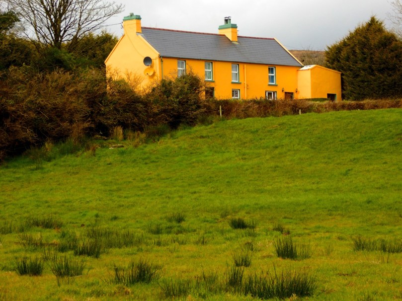
One of my favourites is this house, the colour of a ripe apricot. It is visible from a long way off and always seems to be incandescent on its hillside, as if permanently lit by a setting sun. Close up, I found it has jade green trim, making it even more handsome than it appears from a distance.
That colour is also one of the most recognisable in West Cork because it’s the colour of Jeremy Irons’ Kilcoe Castle. When the castle was being rendered, Irons used a lime mortar in order to waterproof the masonry: the mortar has a distinctive peach tone. Although controversial at the time, it is fair to say that West Cork folk have come to enjoy the sight of this wonderful restored 13th Century castle permanently glowing on its tiny island.
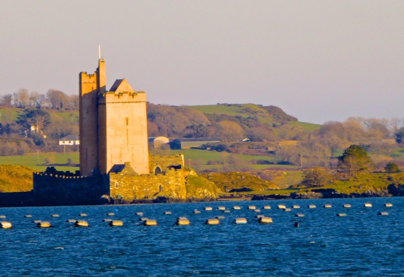
Kilcoe Castle
Pinks range from soft and pastel to the colour of fuchsia.


I particularly like the pink-on-pink trim of the farmhouse below left, and the candy-coloured house with its blue trim.


Yellow shows up well against a green hill. The first house below belongs to our friends the Camiers, who run the marvellous Gortnagrough Folk Museum. The second one is on the Sheep’s Head (photo by Amanda Clarke).


There are shades of salmon and coral that seem to suit old houses very well. Left, below, is the old school house in Rossbrin, now a private residence, and right is the Ballydehob Rectory, particularly attractive with its green trim.


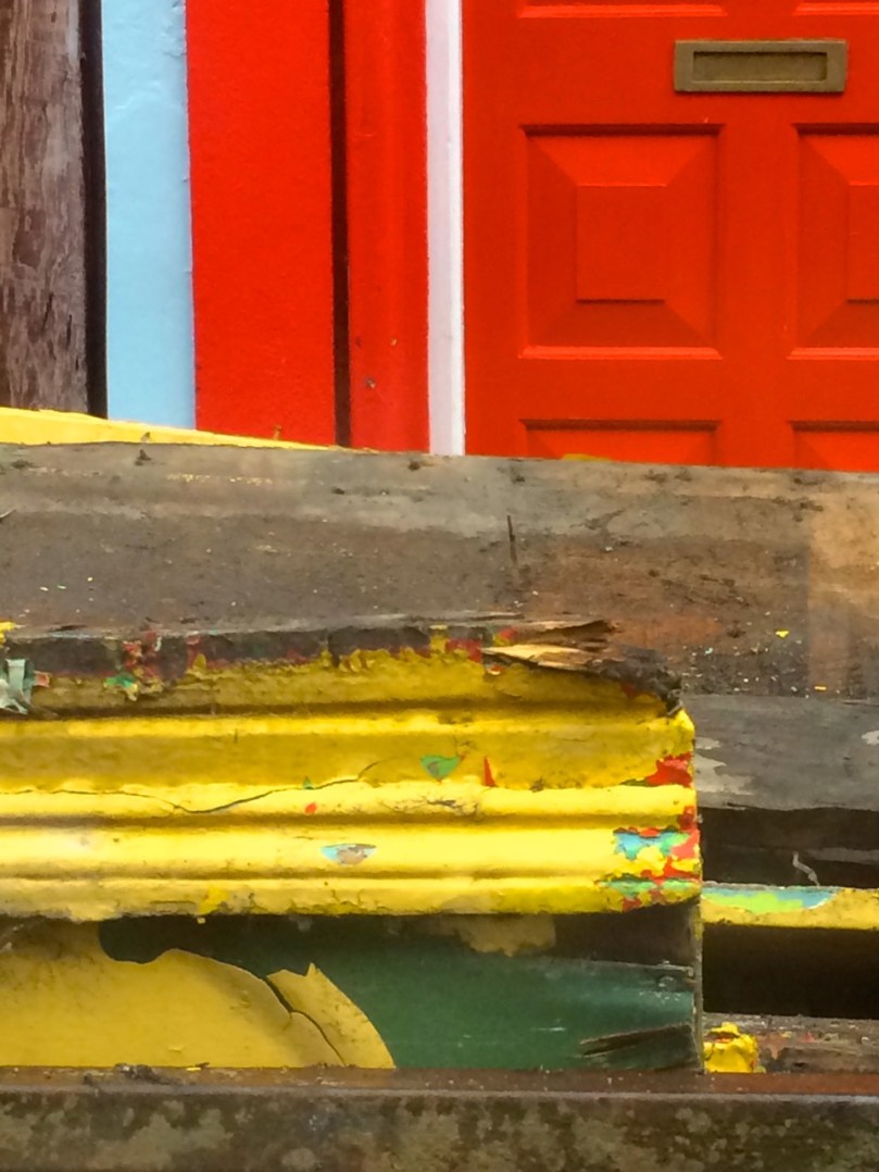
I’ve found red to be reserved mostly for doors, trim and spot colour, but my friend Amanda Clarke found this old farmhouse on the Sheep’s Head. Take a look at her site, Sheep’s Head Places for examples of vernacular farm buildings.
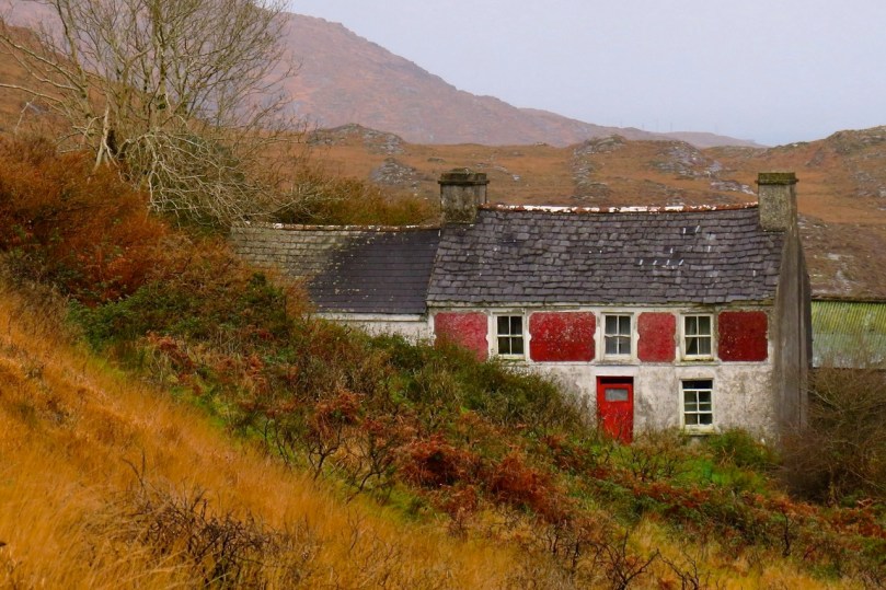
Old farmhouse, Sheep’s Head*
Renovations never stop – I did wonder what colour this one would end up. Now I know!
Going through the spectrum
But this one, unless miracles happen, will see no more paint. Then again, it’s right beside a holy well, so maybe…
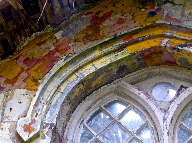
Generations of colour
*Many thanks to Amanda Clarke for the use of the asterisked photographs
