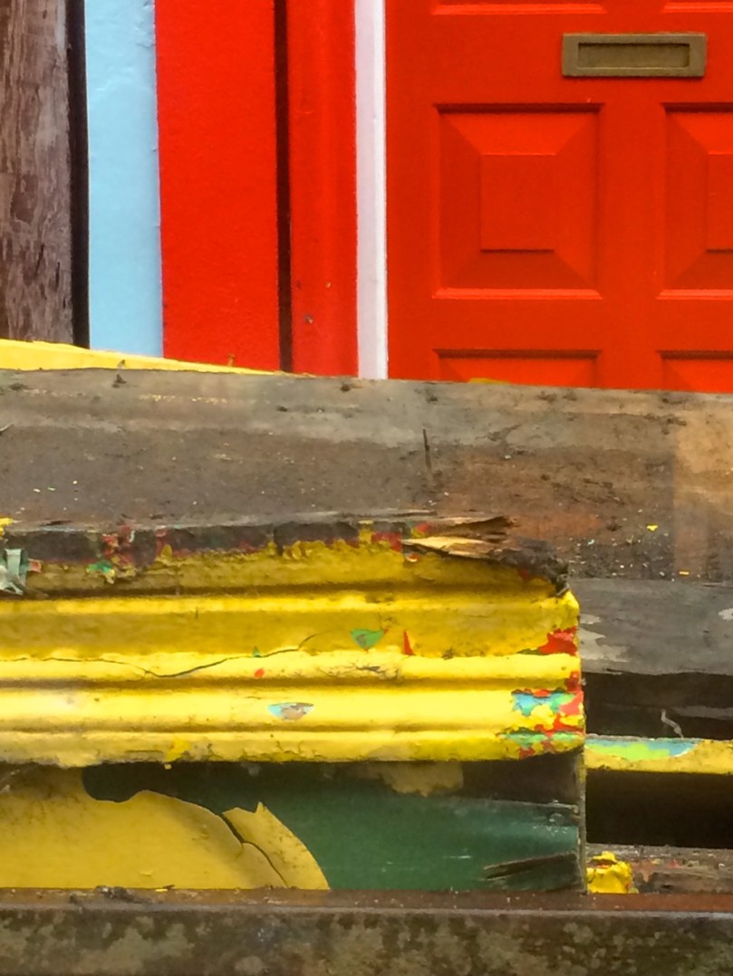
Old vet clinic, Schull
I used to live in Vancouver, on Canada’s west coast. It’s a beautiful city by any standards: gleaming high-rises, miles of seaside walkway, and snow-capped mountains lending a dramatic backdrop. I loved it, but when I looked through my window mostly what I saw was concrete and steel – and no colour! I had to escape up into the mountains or out to the Fraser Valley to get in contact with nature and feed my soul.

Where I used to live

Where I live now
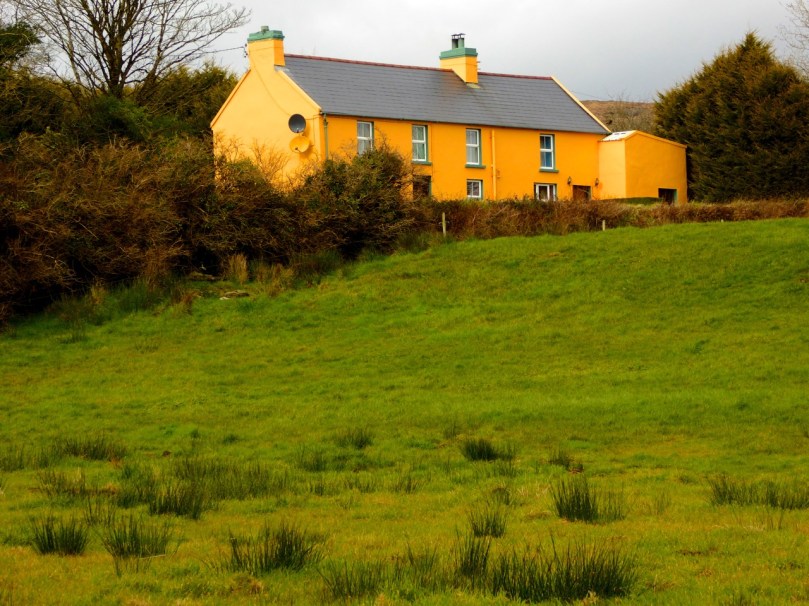
In West Cork, my soul is fed every day, every time I look out the window of our house, every time I stroll through our village of Ballydehob. That’s down to our rural setting, of course, and the magnificent scenery, but a huge part of it is about colour. I’m a colour person, I guess: I respond to it and crave it. I can certainly appreciate a quiet tasteful palate of greys or beiges, or any of the million variations of off-white when I see them. But left to my own devices I’d quickly have a chunk of candy apple red in there, or chairs the colour of daffodils, or a wall in a vivid pink. As Lady Gaga says, I was born that way.

Why is that woman taking my picture?
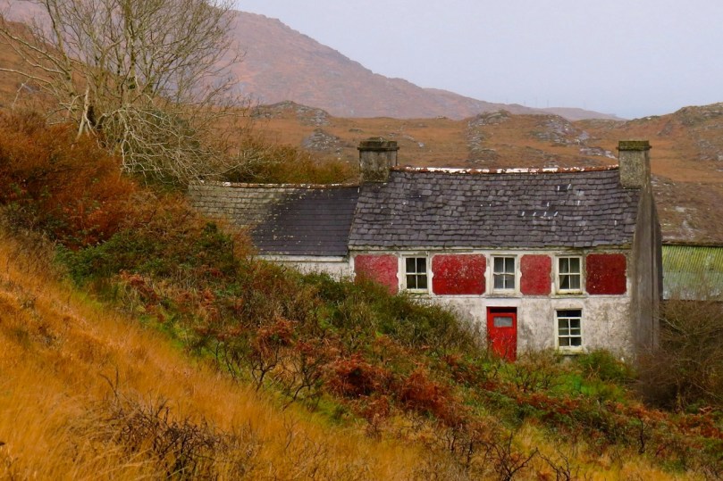
And so I find living in rural Ireland a constant source of delight and inspiration. No country was ever this green, surely! Now the gorse is starting to bloom, turning the hillsides into a blaze of yellow. And every few kilometres along the road is another village or town full of colourful houses competing with each other for my attention. But before we get to the villages, here are some glimpses of houses just off the main roads as you drive those kilometres.


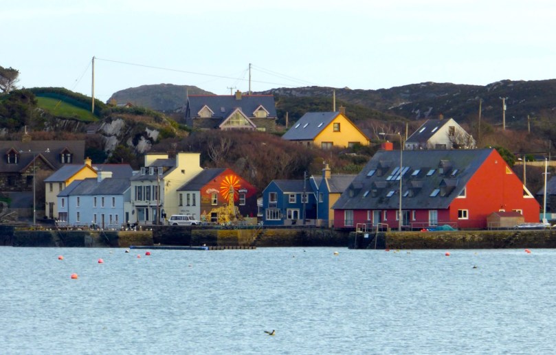
A Lick of Paint mainly featured houses out in the countryside, but for this post I wanted to show you some of my favourite houses in our nearby towns and villages: Ballydehob, Bantry, Skibbereen and Schull.


On the outskirts there are new estates of identical houses, of course, all painted in identical shades of cream. But in the steep and windy streets behind the shops you find little old terraced houses lovingly done up, the walls, doors and windows all in contrasting hues and with knife-edge divisions of colour between neighbours.

Skibbereen townhouse


It can be like walking through a giant Rubik’s Cube (ok, that dates me) or one of those kaleidoscope tubes.


In his book, West of West, published in 1990, Brian Lalor captures my own experience growing up in a sea of grey. He says:
The nineteenth-century photographs of villages and farms show an unrelieved grimness of stone, cement and clay. Whitewash relieves this picture, though frequently this rendering has degenerated into a leprous greyness indicative of neither hope no prosperity. Colour has a symbolic relationship with the state of economics in rural Ireland. The last 20 years have seen the introduction of modern synthetics, bringing vivid tones not previously to be found here. Affluence and the EC have brought, as to the Aegean, a flight from the spartan virtues of white and cream…


Whatever the reason – prosperity, a sense of fun, a wish to lighten the spirits, the influence of the Tidy Towns Competition, an affinity with the colours of the wildflowers in the hedgerows, competition with the neighbours, the need to describe how to identify a house when street numbers are confusing or absent – I am grateful for it. It’s one of the things that makes rural Ireland unique and charming – and it feeds my soul.

Airborne, Schull

The Gables of Ballydehob