Into the Blue…

In this series on Ireland’s colourful buildings, we started off with purple and pink and proceeded through the colour wheel to the oranges and yellows and now we have arrived back on the cool side of the spectrum – the blues and greens. The Diva Cafe in Ballinspittle (above) has black trim that does nothing to tone down its exuberance, and it marries beautifully with the purple and pinks beside it, which were highlighted in our first post on this series.

We left off the last post with a couple of lime greens, so here’s another, from Kinsale (above) to get us back in the swing of things.

A bright green and a blue green are a great combination beside the sea – this house is at Dunmanus, on The Mizen

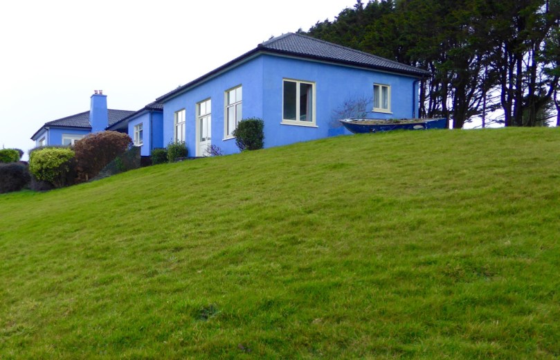
Blues and greens are the colours of the sky and the fields, so they don’t pop as much as the pinks and the oranges. In fact they can be quite subtle, when used in tones that blend in with their surroundings.

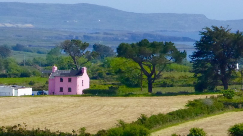
I love these two farmhouses, the first near Mount Kidd and the second near Coppeen

But in village streets, and especially when combined with the other colours of the streetscape, they can be as cheerful and arresting as the stronger hues around them.

Eyeries (top) and Kenmare (bottom)

There are shades of blue and green that people argue over – one will call it blue and another green.

The fabulous Bridge House in Skibbereen – blue or green?

Those are the teals, ceruleans and turquoises, and St Patrick’s Blue, which is the colour of the Aer Lingus uniforms.

Finn’s Table in Kinsale, La Jolie Brise in Baltimore and a lovely brick and teal combo in North Cork

O’Sullivan’s butcher shop in Ballydehob has been closed for years, but it still retails its welcoming colours and graphics

True blues vary from the strong dark ultramarines and navy blues through the denims, duck eggs, periwinkles, sky blues and on to the paler shades and baby blues.

The first house is in Baltimore, the one underneath it was glimpsed somewhere on our travels

Blue matches well with other colours and is often used in combination. Some of the nicest buildings we’ve seen use blue with another colour to great effect.

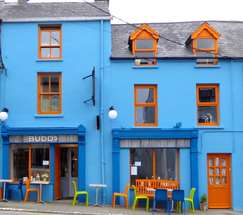
Three wonderful buildings that use blue in combination with orange tones – a bank in Youghal, a hardware store in Bantry and our own Budd’s Restaurant in Ballydehob (with Rosies pub for good measure)

Yellow trim is a tried and true favourite
It might be one of the smallest houses I’ve seen, but it stands out when painted in blue
Blues and greens in Kilbrittain 
This one near Castle Donovan uses a strong blue cleverly as both a main and a trim colour

I’ve decided to end this series with this photograph of two side-by-side buildings in Adrigole on the Beara Peninsula.  The juxtaposition of the strong green and the vivid pink proves that when it comes to colour, anything can work!

Orange to Green – For the Week That’s In It

Right so…where were we when we got interrupted by the bould Saint Patrick? Ah yes, on the red side of the colour wheel. Let’s keep moving, so, on to orange and through the yellows till we hit the greens. (For anyone tuning in for the first time, take a look at Purple and Pink, which also has links to previous posts on our penchant for colourful buildings.)

Biggs is an iconic building in Bantry

We’ll start with the orangey ones (except I couldn’t resist heading off with this gorgeous house on the Beara Peninsula). Orange is a startling shade but also surprisingly sophisticated.

Timoleague (top) and Leap

And some times just plain fun. Nothing like a splash of sunshine to brighten your day!

Kinsale (top) and Goleen

On to the yellows – a favourite of many, it seems, both shop-owners and householders.

Kinsale, Clonakilty, Kilmallock

Depending on the trim, yellow can seem quite electric. I love this shop in Millstreet (above)

This one is in Aghada, East Cork

Wonderful collection of colours on and around this farmhouse
More Kinsale
Eyeries, on the Beara, is one of the most colourful villages in Ireland. It’s where you’ll find the rainbow

The Ludgate Centre, in Skibbereen. It’s just as colourful inside

I’ll stop just shy of true greens and leave them and the blues for next time. The limes, above and below, are the exact right transition colour from yellow. Don’t you agree?

A real beauty, in Kilgarvan

And, if you really need your green fix NOW, head over to Robert’s post, Spring Green.

Purple and Pink – and Everything in Between

Purple house, colourful

You all know of my fascination with the colourful houses that dot the Irish countryside. It’s been a while since I posted about them so for new readers, check out A Lick of Paint and An Extra Lick of Paint and All the Trimmings.

Union Hall Pink

colour-wheelToday I am concentrating on the red side of the colour wheel – from purple to pink. We’ll stop where it shades into blue at one end and orange on the other. This gives us a vast range to choose from and, because it’s all diametrically opposite the greens of the Irish countryside, guarantees that the house will stand out in the countryside.

It’s always a wonderful surprise to come around a corner on a tiny boreen and discover something like this…

Red, Mill Little

Or this…

Pink, North of Skibb

Or this.

colourful, north of Skibb

I’ve included a few shops as well, because – Kinsale! Located on the southernmost extent of the Wild Atlantic Way, it’s one of the most colourful of all Irish towns and a delight to stroll around.

Purple in Kinsale

Janey Mac Purple in Kinsale

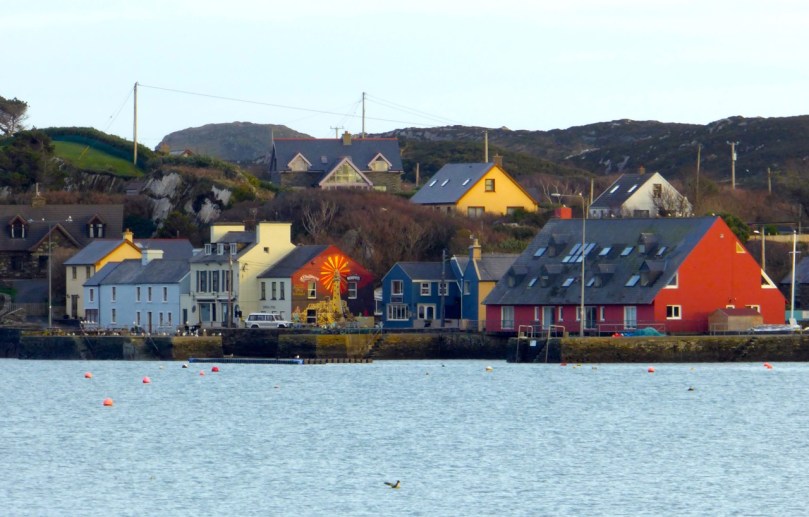
But it’s by no means the only colourful village – lots of other examples here too. Ballinspittle, for example – home of the famous grotto of the moving statue – is a kaleidoscope of colour.

Ena's, Ballinspittal

Ballinspittal red and yellow

Humble terraced cottages can assert their individuality through subtle architectural variations, or through one huge difference – colour!

Kilbrittain Purple

colourful in Millstreet

The main streets of towns and villages are enlivened with splashes of bold colour that catch the eye and brighten your day.

Red and Lilac Timoleague

Purple and red, Ballinspittal

Perhaps one of the best examples I’ve seen of how a building can be transformed by colour comes from our own Ballydehob. Here is the old bank building, abandoned and unloved.

Bank House Before

And here it is now – our vibrant Bank House, home to the Tourist Information Centre and all kinds of events and occasions. As I said – purple and pink display to excellent advantage when contrasted with green!

Bank House from above

Next time we’ll wander over to a different area of the colour wheel. I’ve seen some mighty oranges and limes lately!

All the Trimmings

Near Dunmanway

In my two previous posts on our wonderful West Cork colourful houses, A Lick of Paint and An Extra Lick of Paint, I’ve concentrated on overall house colour and on how that colour stands out in the landscape or the streetscape. Since that second post was written, in March, two of the most colourful houses I photographed have been re-painted, both in shades of khaki. Am I chronicling an endangered species? I hope not!

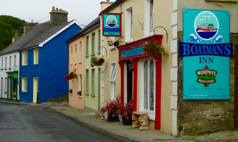
Boatmans

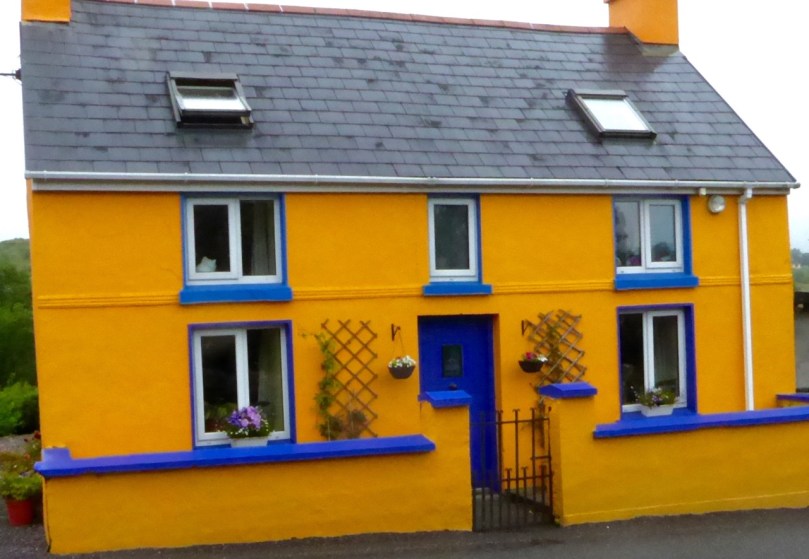
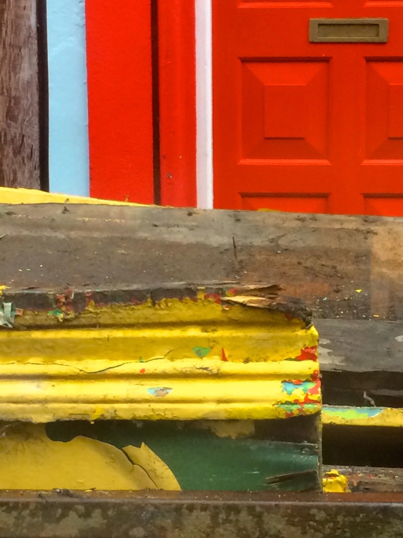
So in the spirit of celebrating our colourful tradition, I am devoting a post to the trim choices – the window surrounds, the doors and the chimneys, the shop fronts – that add to the vibrancy and delight of our neighbourhoods, villages and countryside.

VERY VERY PINK

The most common trim choice is white and often that seems the only, or perfect, choice. Or perhaps the safest. It certainly provides a lively contrast to a bold colour.

Marine blue

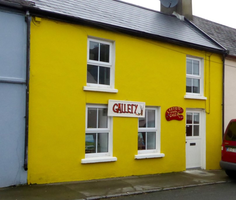
Orange you glad to see me?Gallery, Union HallWhite and bold-colour contrast can also look charming the other way around – white walls and colourful trim.

However, the juxtaposition of two bold colours, or even three, for walls and trim is irresistible.

Purple on Mustard

Windows are a natural focus for colour. Sometimes the frame and the surround is painted the same colour and sometimes two colours are employed, both contrasting with the wall colour.

Ballydehob windowsills

A local tradition seems to be to paint the chimneys the same colour as the walls, although occasionally the trim colour is used instead. I particularly like the chimneys in Eyries on the Beara Peninsula. Note the jaunty use of the trim colour on the chimney pots, on the second-to-last house in the lower photograph.

Eyeries Chimneys

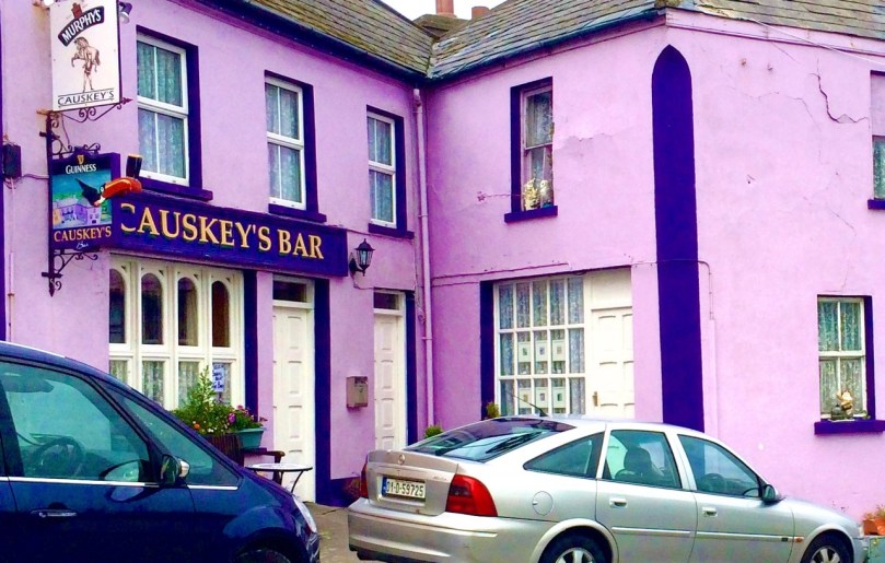
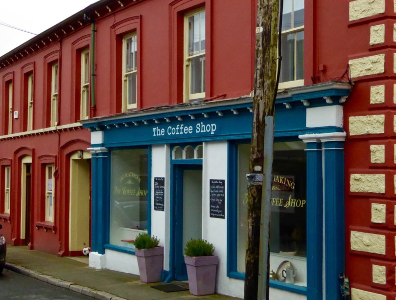
chimney trimMany traditional village or town commercial buildings here are masonry, with the shop-fronts in painted wood. A few examples here – although traditional shop-fronts deserve a post to themselves at some point. I also include cafés, restaurants and pubs in this category.

Causkey's

The Coffee Shop Union Hall

Kinsale is a cornucopia of colour! Herewith just a few examples of what you’ll find if you wander its streets.

Van

Trim colour is often used to good effect on garden walls and gate posts in addition to the house. Here’s a fetching example from near Union Hall .

Swedish

So – what do you think, Dear Reader? Do you have a favourite among these examples? Do you have any photos of your own to share? If so, comment below, or drop by our Facebook Page and vote for the one you like best. I will finish with one of my own current favourites and an exuberant addition to Ballydehob.

Budds

An Extra Lick of Paint

Old vet clinic, Schull

Old vet clinic, Schull

I used to live in Vancouver, on Canada’s west coast. It’s a beautiful city by any standards: gleaming high-rises, miles of seaside walkway, and snow-capped mountains lending a dramatic backdrop. I loved it, but when I looked through my window mostly what I saw was concrete and steel – and no colour! I had to escape up into the mountains or out to the Fraser Valley to get in contact with nature and feed my soul.

Where I used to live

Where I used to live

Where I live now

Where I live now

In West Cork, my soul is fed every day, every time I look out the window of our house, every time I stroll through our village of Ballydehob. That’s down to our rural setting, of course, and the magnificent scenery, but a huge part of it is about colour. I’m a colour person, I guess: I respond to it and crave it. I can certainly appreciate a quiet tasteful palate of greys or beiges, or any of the million variations of off-white when I see them. But left to my own devices I’d quickly have a chunk of candy apple red in there, or chairs the colour of daffodils, or a wall in a vivid pink. As Lady Gaga says, I was born that way.

Why is that woman taking my picture?

Why is that woman taking my picture?

And so I find living in rural Ireland a constant source of delight and inspiration. No country was ever this green, surely! Now the gorse is starting to bloom, turning the hillsides into a blaze of yellow. And every few kilometres along the road is another village or town full of colourful houses competing with each other for my attention. But before we get to the villages, here are some glimpses of houses just off the main roads as you drive those kilometres.

A Lick of Paint mainly featured houses out in the countryside, but for this post I wanted to show you some of my favourite houses in our nearby towns and villages: Ballydehob, Bantry, Skibbereen and Schull.

On the outskirts there are new estates of identical houses, of course, all painted in identical shades of cream. But in the steep and windy streets behind the shops you find little old terraced houses lovingly done up, the walls, doors and windows all in contrasting hues and with knife-edge divisions of colour between neighbours.

Skibb town house 2

Skibbereen townhouse

It can be like walking through a giant Rubik’s Cube (ok, that dates me) or one of those kaleidoscope tubes.

In his book, West of West, published in 1990, Brian Lalor captures my own experience growing up in a sea of grey. He says:

The nineteenth-century photographs of villages and farms show an unrelieved grimness of stone, cement and clay. Whitewash relieves this picture, though frequently this rendering has degenerated into a leprous greyness indicative of neither hope no prosperity. Colour has a symbolic relationship with the state of economics in rural Ireland. The last 20 years have seen the introduction of modern synthetics, bringing vivid tones not previously to be found here. Affluence and the EC have brought, as to the Aegean, a flight from the spartan virtues of white and cream…

Whatever the reason – prosperity, a sense of fun, a wish to lighten the spirits, the influence of the Tidy Towns Competition, an affinity with the colours of the wildflowers in the hedgerows, competition with the neighbours, the need to describe how to identify a house when street numbers are confusing or absent – I am grateful for it. It’s one of the things that makes rural Ireland unique and charming – and it feeds my soul.

Airborne, Schull

Airborne, Schull

The Gables of Ballydehob

The Gables of Ballydehob


A Lick of Paint

blue long distance

What does it mean to say that a house is “set well into the landcape?” On the West Coast of Canada, where I used to live, it usually meant that a house was invisible, often made of wood and blending into the trees. But here in rural West Cork, buildings are more assertive – we ARE the landscape, they seem to say, or at least an important part of it. Therefore we should stand out and be seen. Part of being seen, for many houses in the countryside, is choosing a bright colour. Ah sure, they say, all it needs is a lick of paint.

Crookhaven

Crookhaven


I’ve written before about the colourful towns and villages dotted all over Ireland. Coming around a bend in the road and catching sight of a village is a cheering experience: flashes of colour spread in a line across a backdrop of green fields or rugged mountains. But colour isn’t confined to towns – farmhouses in the deep countryside can suddenly demand attention – pops of colour in a predominantly green terrain. 

Blue seems to be a favourite – and we are not talking here about a pale blue or grey blue. No – duck egg or cobalt blues predominate. The blue is weathering and fading a bit in the house below but it still packs a punch in its isolated setting.

Sometimes blue is used on one side of the house only, or on selective aspects – a gate post or a shutter.

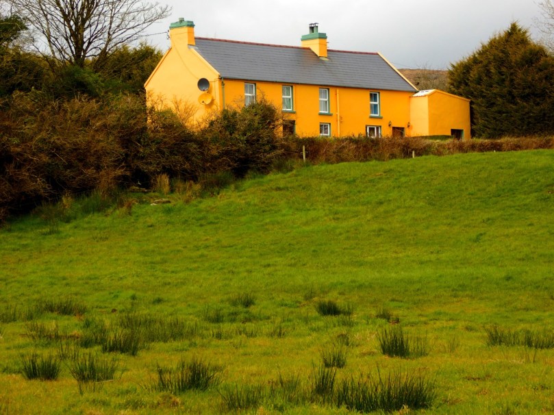
One of my favourites is this house, the colour of a ripe apricot. It is visible from a long way off and always seems to be incandescent on its hillside, as if permanently lit by a setting sun. Close up, I found it has jade green trim, making it even more handsome than it appears from a distance.

apricot distant

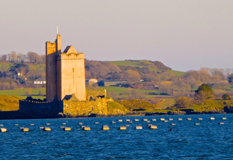
That colour is also one of the most recognisable in West Cork because it’s the colour of Jeremy Irons’ Kilcoe Castle. When the castle was being rendered, Irons used a lime mortar in order to waterproof the masonry: the mortar has a distinctive peach tone. Although controversial at the time, it is fair to say that West Cork folk have come to enjoy the sight of this wonderful restored 13th Century castle permanently glowing on its tiny island.

Kilcoe Castle

Kilcoe Castle

Pinks range from soft and pastel to the colour of fuchsia.

I particularly like the pink-on-pink trim of the farmhouse below left, and the candy-coloured house with its blue trim.

Yellow shows up well against a green hill. The first house below belongs to our friends the Camiers, who run the marvellous Gortnagrough Folk Museum. The second one is on the Sheep’s Head (photo by Amanda Clarke).

There are shades of salmon and coral that seem to suit old houses very well. Left, below, is the old school house in Rossbrin, now a private residence, and right is the Ballydehob Rectory, particularly attractive with its green trim.

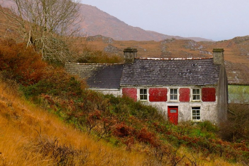
I’ve found red to be reserved mostly for doors, trim and spot colour, but my friend Amanda Clarke found this old farmhouse on the Sheep’s Head. Take a look at her site, Sheep’s Head Places for examples of vernacular farm buildings. 

Old farmhouse, Sheep's Head

Old farmhouse, Sheep’s Head*

Renovations never stop – I did wonder what colour this one would end up. Now I know!

Going through the spectrum

Going through the spectrum

But this one, unless miracles happen, will see no more paint. Then again, it’s right beside a holy well, so maybe…

Generations of colour

Generations of colour

 *Many thanks to Amanda Clarke for the use of the asterisked photographs